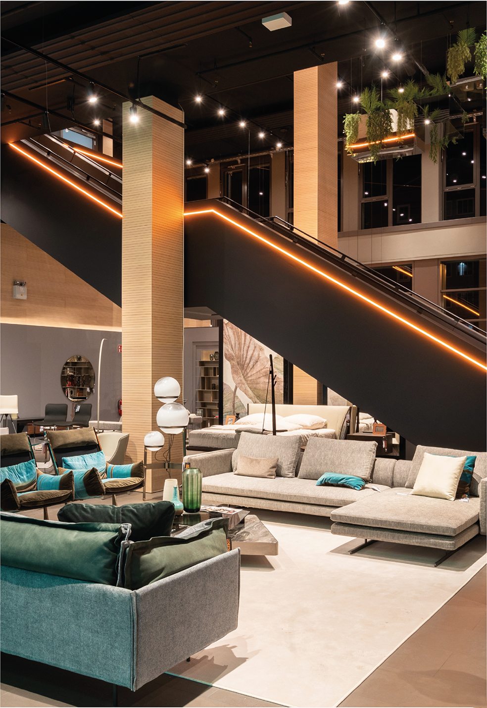
Who's Perfect, DriussoAssociati Architects
In the restoration the facade solution was also revised, understood as an integral part of the company’s communication with the outside, thanks to the inclusion of two entrance portals, a new color of the facade and the chromatic play on the windows coordinated with the Brand Identity.
The project is developed on different levels and different heights, from 3 to 10 meters, which merge together alternating the important volumes. It’s an articulated space, composed of coordinated settings designed to hold the best of Italian design.
That’s how was born an exhibition itinerary where light enhances the various thematic areas and carry the visitor in a multi-sensory experience with an elegant atmosphere. Chromatic and sensory suggestions are accentuate thanks to the accurate lighting, acoustic and installation study.
The spaces have been defined with devoted visuals; entrance, reception, customer metting areas, exhibition areas, bar, restroom and offices find an optimal location.
Particular attention was also dedicated to the acoustic well-being where the correct balance has been achieved thanks to the use of large coating systems with sound wave balancing function.
Punctual multimedia insertions consisting of large ledwalls distributed on the focal spots of the exhibition itinerary follow the user during his visit, immersing him in the Italian design world.
